Hard Rock Cafe
Established in London in 1971, Hard Rock Cafe Inc. operates in over 80 countries with 300+ branded venues, 38 hotels, and 19 casinos, spanning distinct business lines under one global brand.
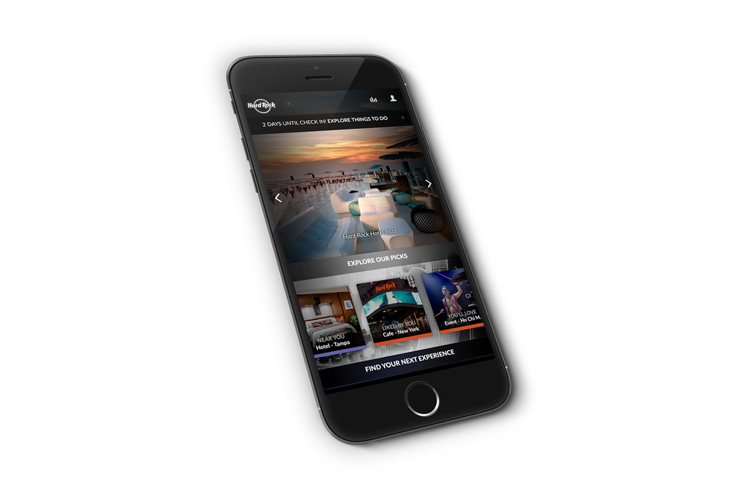
Hard Rock engaged Useablenet with the following goals for a new mobile app:
One brand, three fundamentally different business models (quick-service cafes, hotel stays, casino visits), each with different customer intents, time on-site, and touch points
A single app had to flex across all three without feeling generic in any of them
Current experience was fragmented: not seamless across Hard Rock properties and digital channels, with booking flows that varied by property type and were not universally optimized
Underlying usability issues (text, controls, navigation) and performance problems (app not optimized for speed/page load) compounding the fragmentation
Business goals (KPIs)
Ensure ongoing app usage
Increase revenue per visit
Improve overall Hard Rock customer experience
Experience must be simple, shoppable, and act as a hub for fresh content
Team: As Senior Designer, I reported to our Design Lead, and was main design contact for the client. In addition to having responsibility for the experience strategy, UX/UI work and final deliverables, I led the workshopping process, with participation from our content strategist, research manager, PM, marketing manager, and a client representative.
Timeline: Two weeks, start to finish. The client provided a brief with suggested goals for the app and a two-week window to develop a point of view and concept.
Process
Hard Rock provided a brief outlining suggested goals for the app, but no additional discovery or research, the two-week timeframe didn't allow for a separate research phase, and there was no budget for user testing. Given those constraints, the approach centered on fast, structured synthesis rather than primary research: translating the brief's goals directly into workshop-driven concept development.
I led collaborative sessions with our content strategist, research manager, PM, marketing manager, and a client representative, generating early concepts for the onsite schedule/filter overlay, home screen, onsite map, and rewards ("pin collector") screen
Progression from sketches → structured screen designs organized around the three journey phases: pre-visit, on-site, post-visit
No user testing was conducted on this project due to budget constraints.
Initial workshop sketching

(l-r) onsite schedule w/filter overlay, home screen

(l-r) onsite map, pin collector rewards screen
High-fidelity screens
Pre-Visit
Personalized home screen: brand-wide header (all HR property types in one dropdown), dynamic hero carousel, personalized recommendations by location/preference/past behavior
First-time users see cafe, hotel, and casino recommendations based on location
Discovery via clickable global map and search; quick-book directly from home
"Customize Your Experience" overlay: itinerary, F&B/spa options, reservations, offers, concierge access


On-Site
Mode shift on login to contextual "on-site" experience, dynamic top nav changes functionality based on context
Itinerary Builder/View for managing the in-progress visit
Location-aware map (self + group location, upcoming event markers) and beacon-supported hyper-local offers
Footer utilities: concierge/chat, merchandise browsing, property map, in-app camera
These are examples of complex-systems design that made this project exciting and challenging: location tech, beacon infrastructure, real-time messaging, and merchandising all had to be coordinated within a single contextual shell that adapts based on where the guest is and what property type they're at


Post-Visit
"Relive" content zone: timeline of experiences/memories, aggregated Instagram-tagged images (#HardRock), personalized Hard Rock travel posters
Direct CTA back into planning the next visit, closing the loop pre → on → post → pre again
"Relive" was designed to serve the stated KPIs directly: keeping guests engaged with the app after checkout supports ongoing app usage, and the direct CTA back into planning gives that engagement a clear path toward the next booking and revenue per visit, the post-visit experience isn't a nostalgia feature, it's the mechanism that turns a single visit into a repeat-visit funnel

Status & Reflection
Working from a brief and a two-week timeline, with no budget for user testing, the team developed a unified point of view and concept for reconciling three distinct business lines, cafes, hotels, and casinos, into one connected pre/on/post-visit system. Hard Rock stakeholders responded well to the concepts, but due to shifting internal priorities on the client side, chose not to move forward with implementation at that time, the designs were not built or launched.
Had it moved to implementation, the unified pre/on/post-visit system was designed to directly serve Hard Rock's stated goals of increasing app engagement and revenue per visit by closing the loop between visits rather than treating each as a standalone transaction.
Looking back, this project is a good example of what's achievable under real-world constraints: a two-week turnaround, a single brief in place of a discovery phase, and no testing budget, conditions that are common in agency work but rarely acknowledged in a portfolio. Producing a coherent systems-level concept across three business lines in that window relied heavily on fast, structured facilitation rather than extended research, which is its own kind of leadership skill. If I were scoping a project like this today, I'd push earlier for either more time or a phased approach that built in even lightweight validation before presenting a fully-formed concept, a lesson I now apply when scoping cross-functional work with compressed timelines.