Darby Dental is one of the top distributors of dental supplies in the United States, with more than 40,000 different products in several strategically located warehouse and distribution centers across the country.
GOALS
Darby Dental wanted to redesign their existing app and improve the visibility and usability of high-value tools to provide better service to their customers.
• Improve usability of high-value tools for easy access to the most important shopping/ordering features
• Design for flows optimizing experience for both prospective and returning online customers
• Build confidence through more contemporary look and feel, especially on the homepage
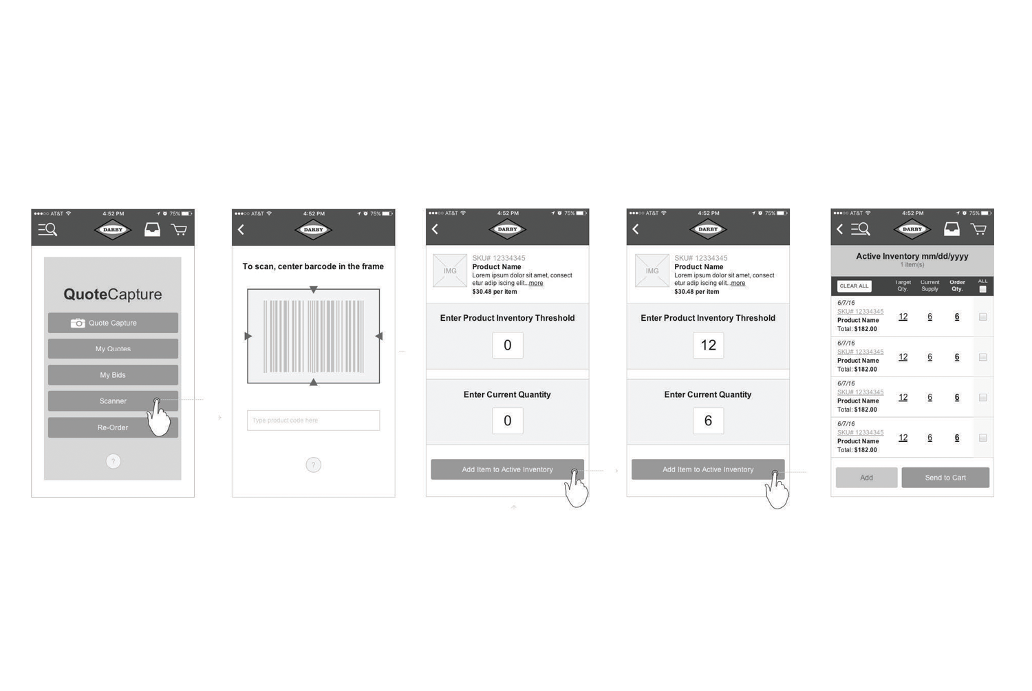
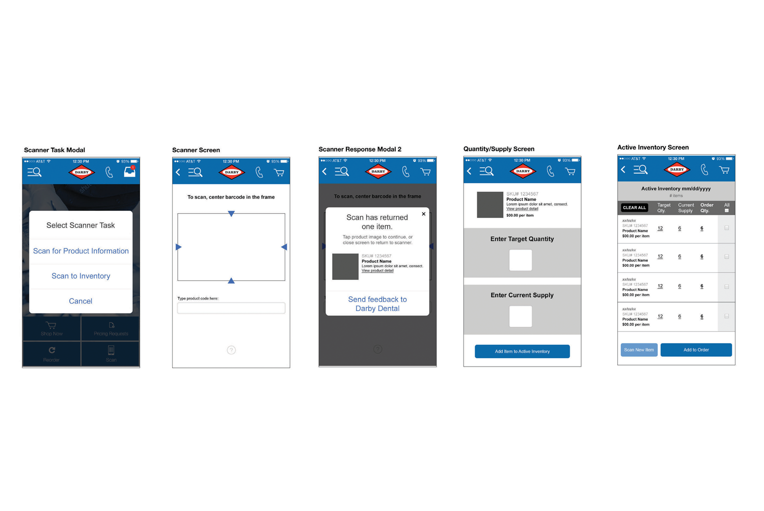
• Develop an intuitive flow for the new Active Inventory feature
Key elements of the new app include:
• Easy ability to Reorder
• Scan-to-Order
• Scan-to-Inventory
• Competitive Price Analysis Tools (Quick Quotes & Pricing Requests)
• Include all mobile web features and functionality
• Provide push notifications about order status, delivery status, flash sales, promotions, etc.
PROCESS
• Research
- Stakeholder Interviews
- Review of Customer Service logs
- User Interviews
• Initial Sketching
• Creation of Initial User Flows
• Wireframing & Dev Review
• UI & Dev Review
• Prototypes
• Testing
• Final Revisions and Dev Review
• Creation of Style Guide & Assets
TOOLS
• Sketching
• Axure
• Photoshop
• Illustrator
• InVision
• Principle
MEASUREMENT OF SUCCESS
The Darby Dental App launched in May 2016 and was quickly adopted by many of Darby's top customers, with specific positive reviews about the Scanning, Reorder and Active Inventory features. Currently in the process of designing several app enhancements.
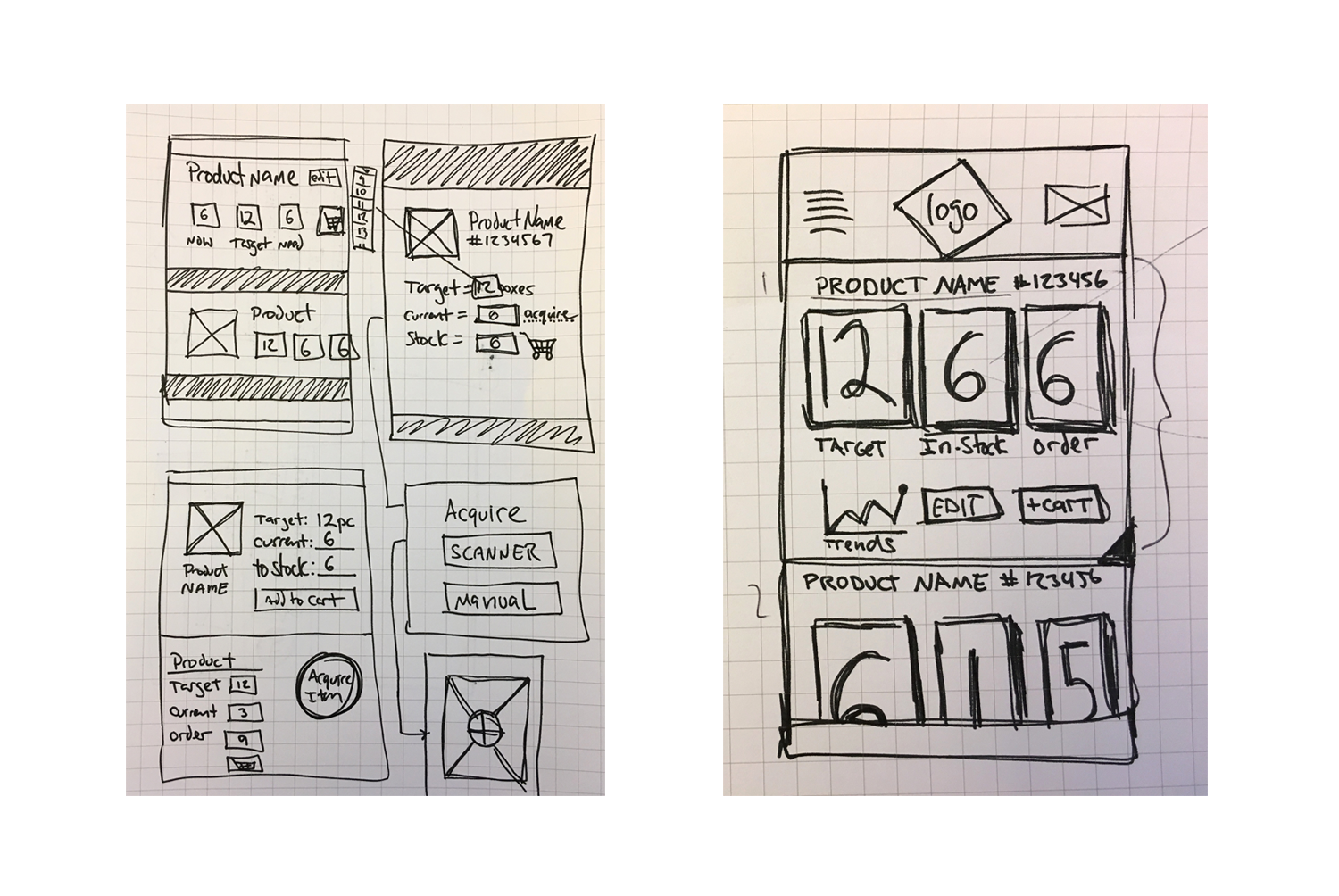
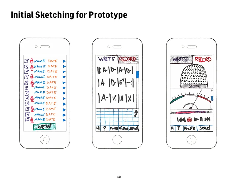
Initial sketches for Inventory features
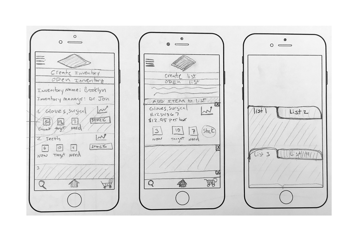
Higher fidelity sketching of Inventory features
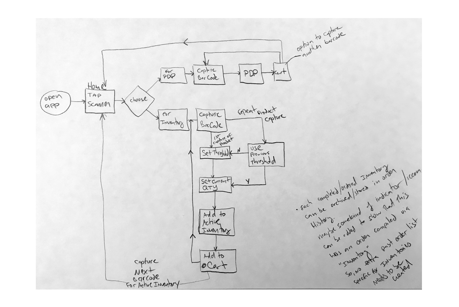
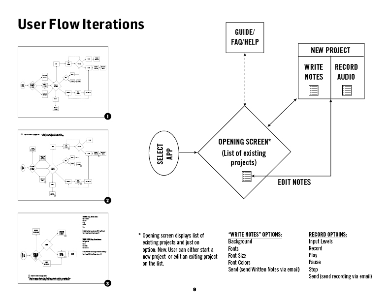
Early User Flow and notes
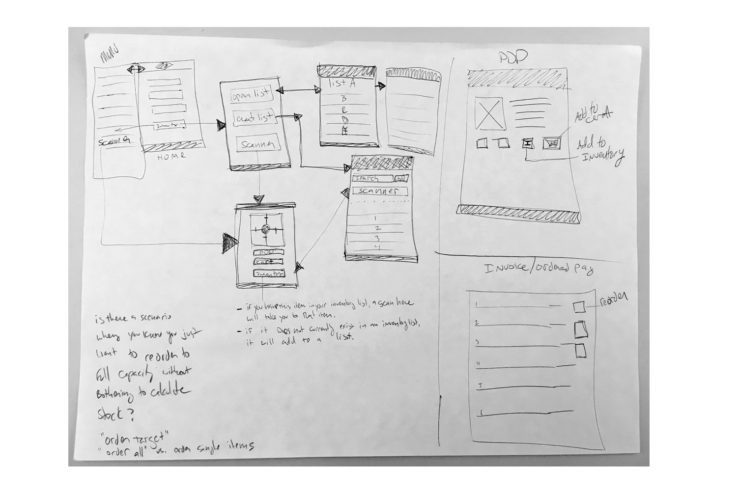
Early "wire-flows" and workshop notes
Axure wireframes of "scan to inventory" flow
Higher-fidelity mock-ups of "scan to inventory" flow
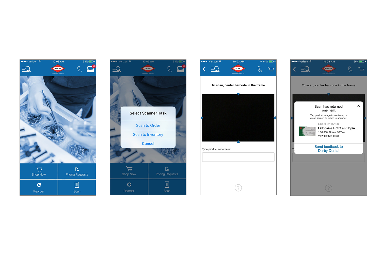
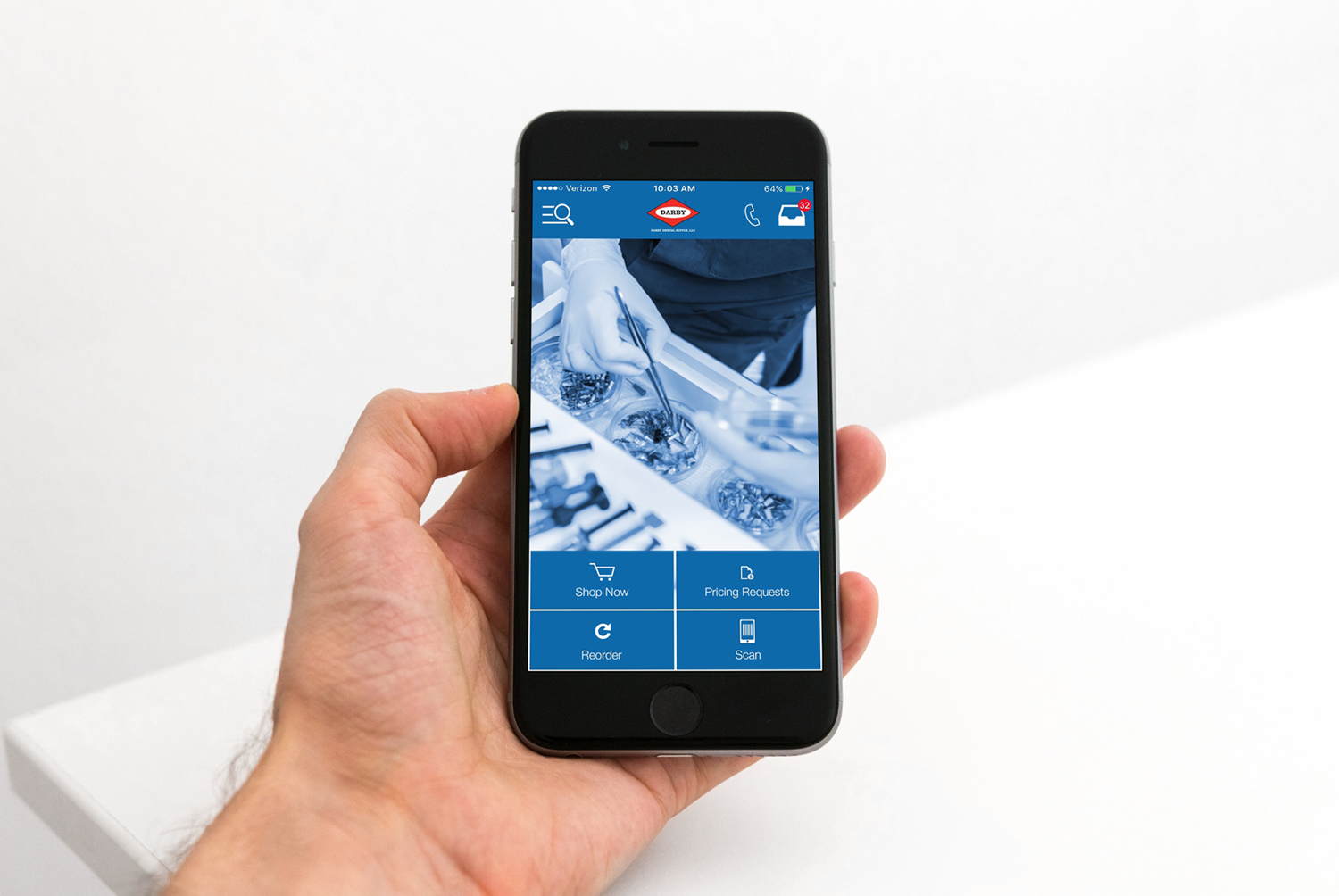
Final screens (Home screen, Scan modal, Scanner, Captured product from scan)
Hard Rock Cafe Inc. is a chain of theme restaurants founded in 1971 by Isaac Tigrett and Peter Morton in London. Now headquartered in Orlando, Florida, as of December 2015, there were 191 Hard Rock locations in 59 countries, including 168 cafes, 23 hotels, and 11 casinos.
GOALS
• Create a new Mobile App to enhance the customer’s complete journey: pre-visit; on-site and post-experience
• Improve the customer experience through great UX/UI, effective use of native device capability, location-based technology and effective use of great content and features.
High-level App KPI’s:
• Ensure ongoing app usage
• Increase revenue per visit
• Improve Hard Rock customer experience
CURRENT EXPERIENCE
•Usability: Issues with text, user controls, navigation, design
•Experience is not seamless across HR properties and digital channels
•Booking flow is varied and not universally optimized
•App not optimized for speed and performance (page load)
APP IDEATION: STRATEGY PLATFORM
Consumers want Simple, Personal, Social.
Opportunity: Create an “All in One” Hard Rock Destination.
Challenges:
• Aggregate, but keep it simple/easy
• Every experience must be shopable
• A hub for fresh content and experiences
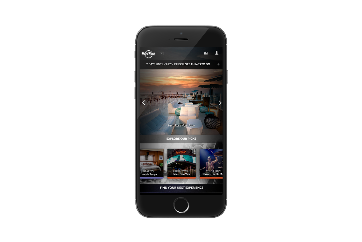
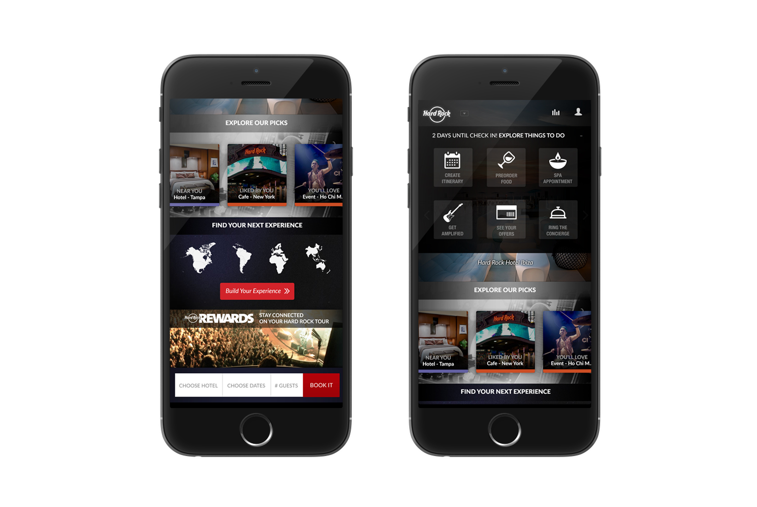
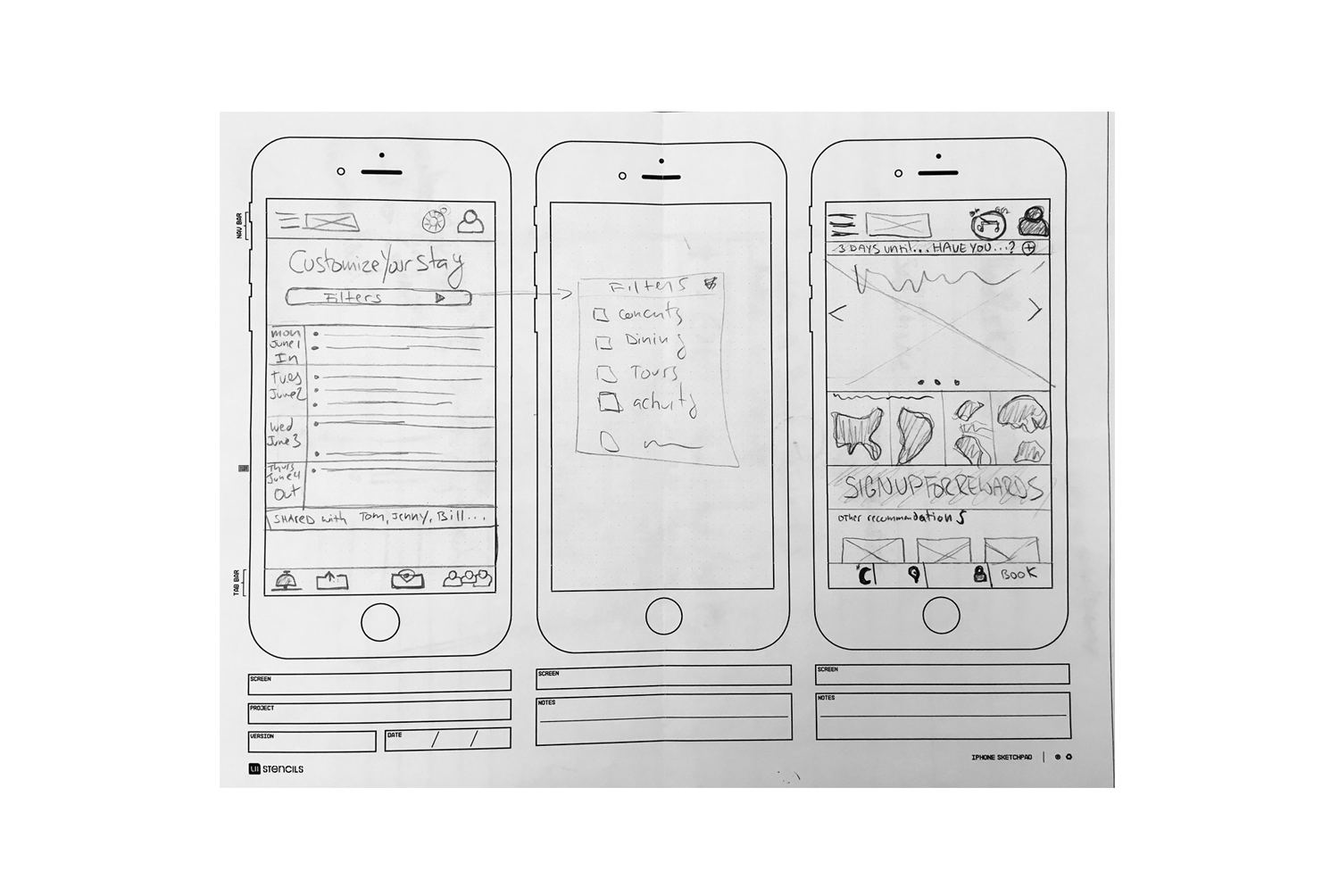
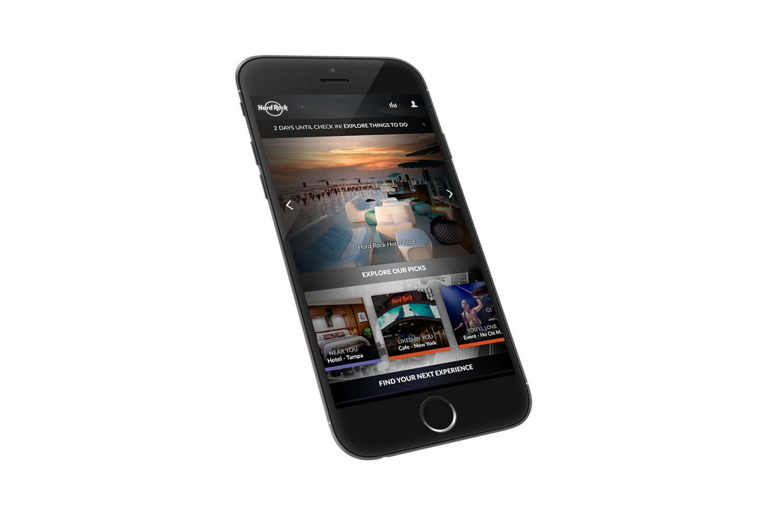
• Global Header: All Hard Rock brand logos available in drop-down (left). Streaming sound icon for HR music (right) and My Account log-in icon (far-right).
• Upcoming trip reminder. Opens to overlay with pre-arrival preferences.
• Dynamic Image carousel: Hero images of mix of Hard Rock experiences.
• Personalized recommendations based on user location, preferences and past behaviors. First-time users see café, hotel and casino recommendations based on user location.
• Discovery: Search hotels and experiences by country (clickable global map and search results)
• Rewards log-in from home screen
• Quick-book functionality: From home screen users can search and book
• Customize your Experience Overlay with pre-arrival preferences:
- View Itinerary with activity recommendations
- Food & Beverage, and Spa options
- Guitar Icon: Reservations
- Relevant offers based on the upcoming trip
- Concierge icon -access to all guest services (e.g. request early check-in)
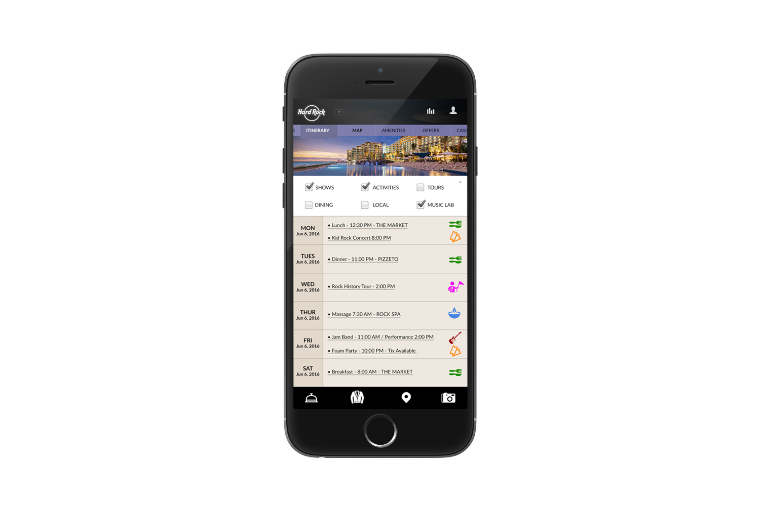
• Logged-in user; “on-site” mode
• Dynamic Top Navigation with distinct functionality and contextual content
• Itinerary Builder –Overview of available experiences
• Itinerary View –Create and manage the experience. Select icon representing offers and recommendations, based on user location.
• Global footer
- Concierge Bell: Access to all guest services and chat
- Jacket icon: Hard Rock merchandise for browsing and buying
- Location icon: Access to Interactive property map (see next slide)
- Camera: launch device camera
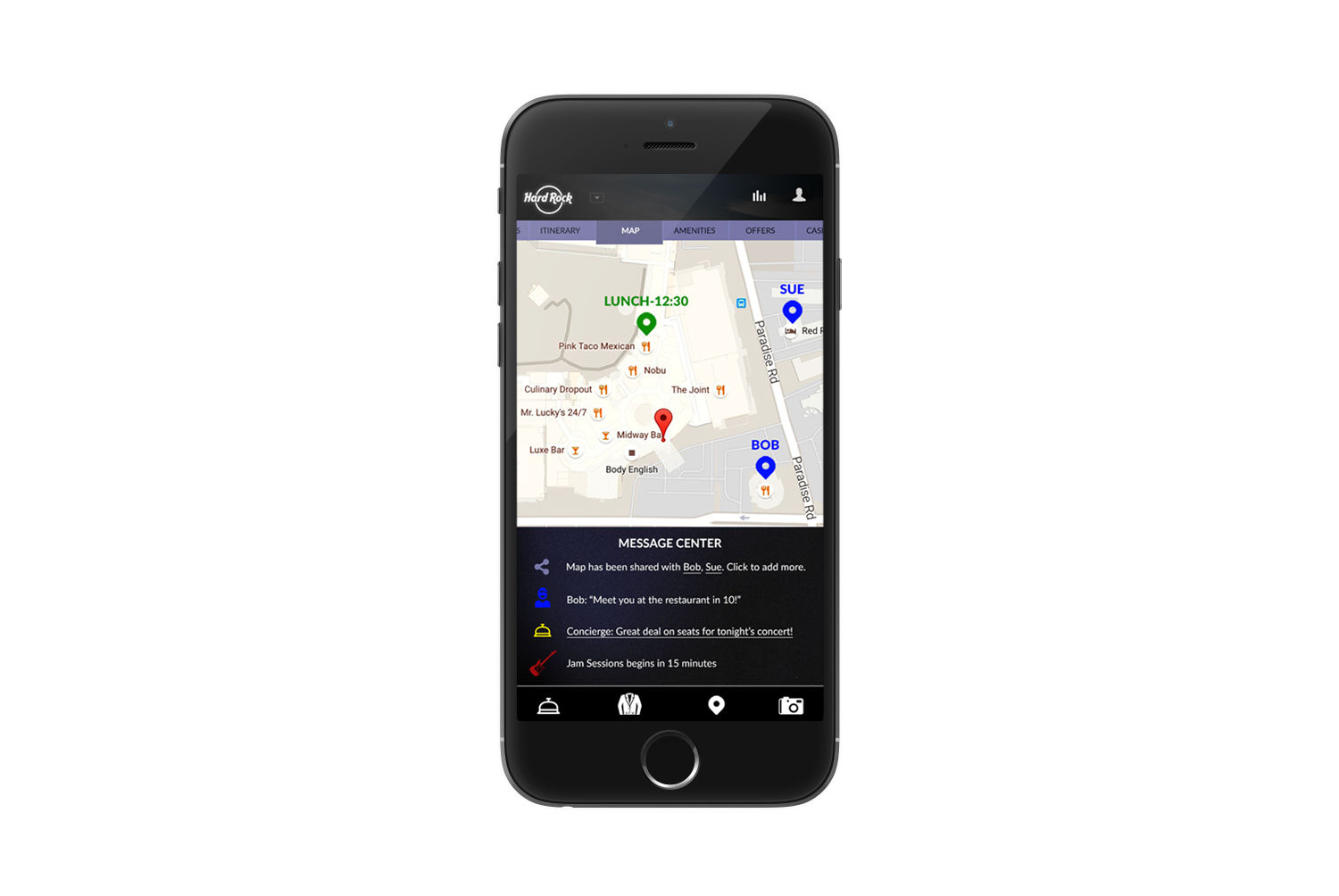
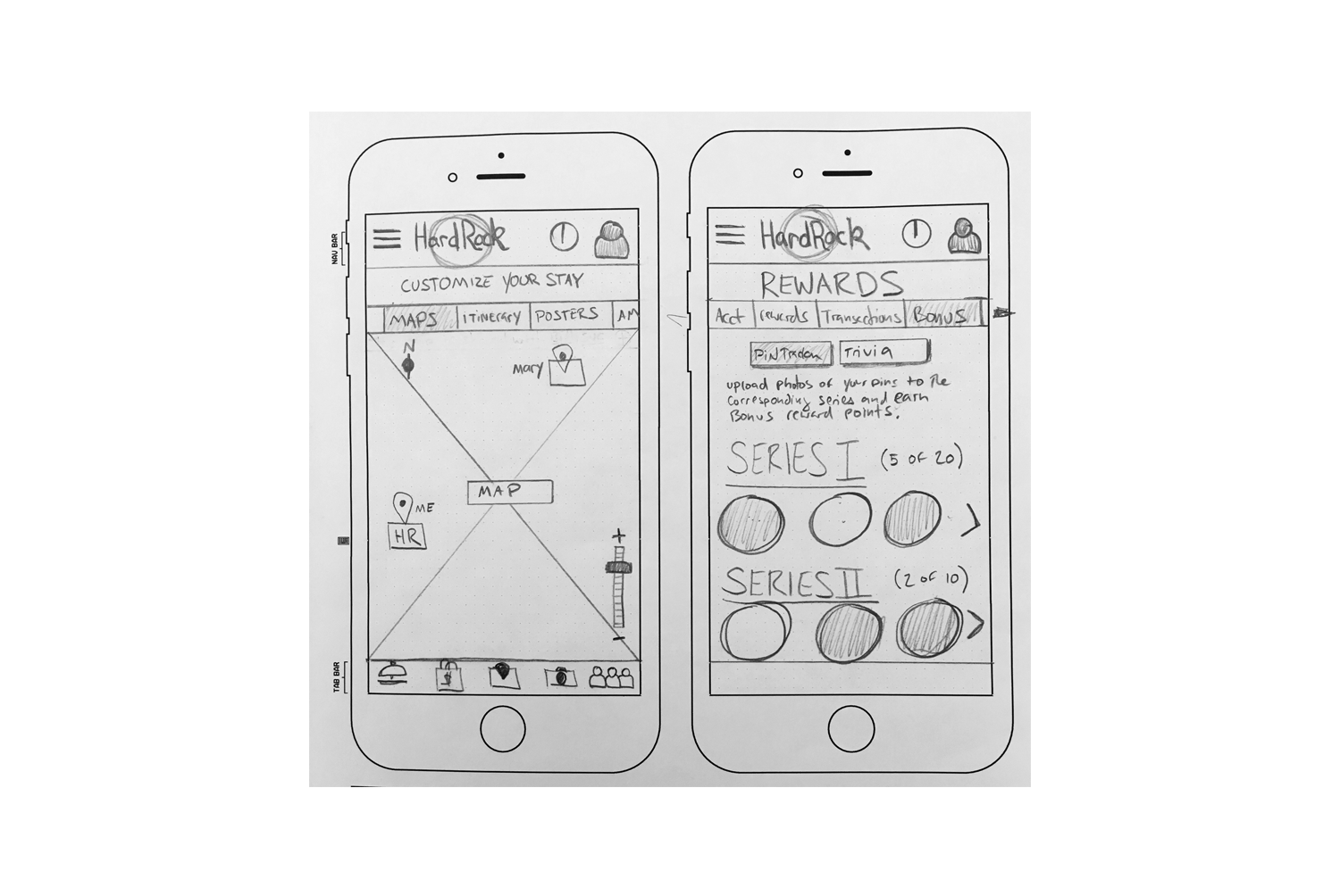
• Location-aware Map: This view enables users to:
-View and share their current location
-View location of others in their group
-See icons and reminder for upcoming events and reservations
• Message Center: Content area for alerts and notifications
- Hyper-local offers and promotions (supported by beacon technology)
- Event and reservation reminders
- Messages from Hard Rock and /or other on-site guests
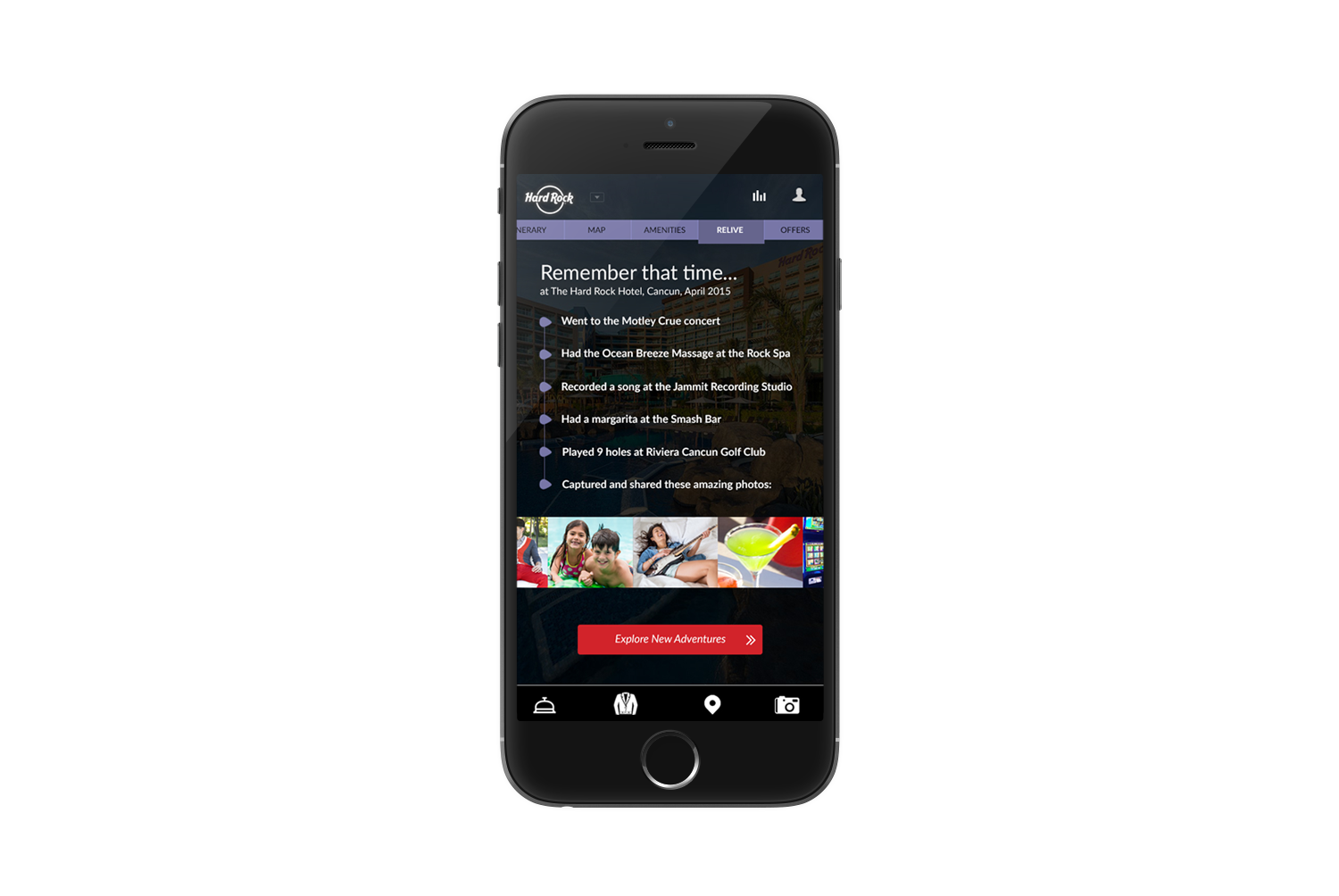
User has selected “Relive” from top navigation.
• Relive: A content zone for moments, memories and experiences
• “Timeline” view of their experiences and images of the memories they captured and uploaded
• Showcase of images tagged and shared via Instagram (eg#HardRock) or images personalized in-app with Hard Rock Travel Posters
• CTA: While reflecting on their recent experience, users can start to search and plan their next Hard Rock experience
Uline is the leading distributor of shipping, industrial and packaging materials to businesses throughout North America.
GOALS
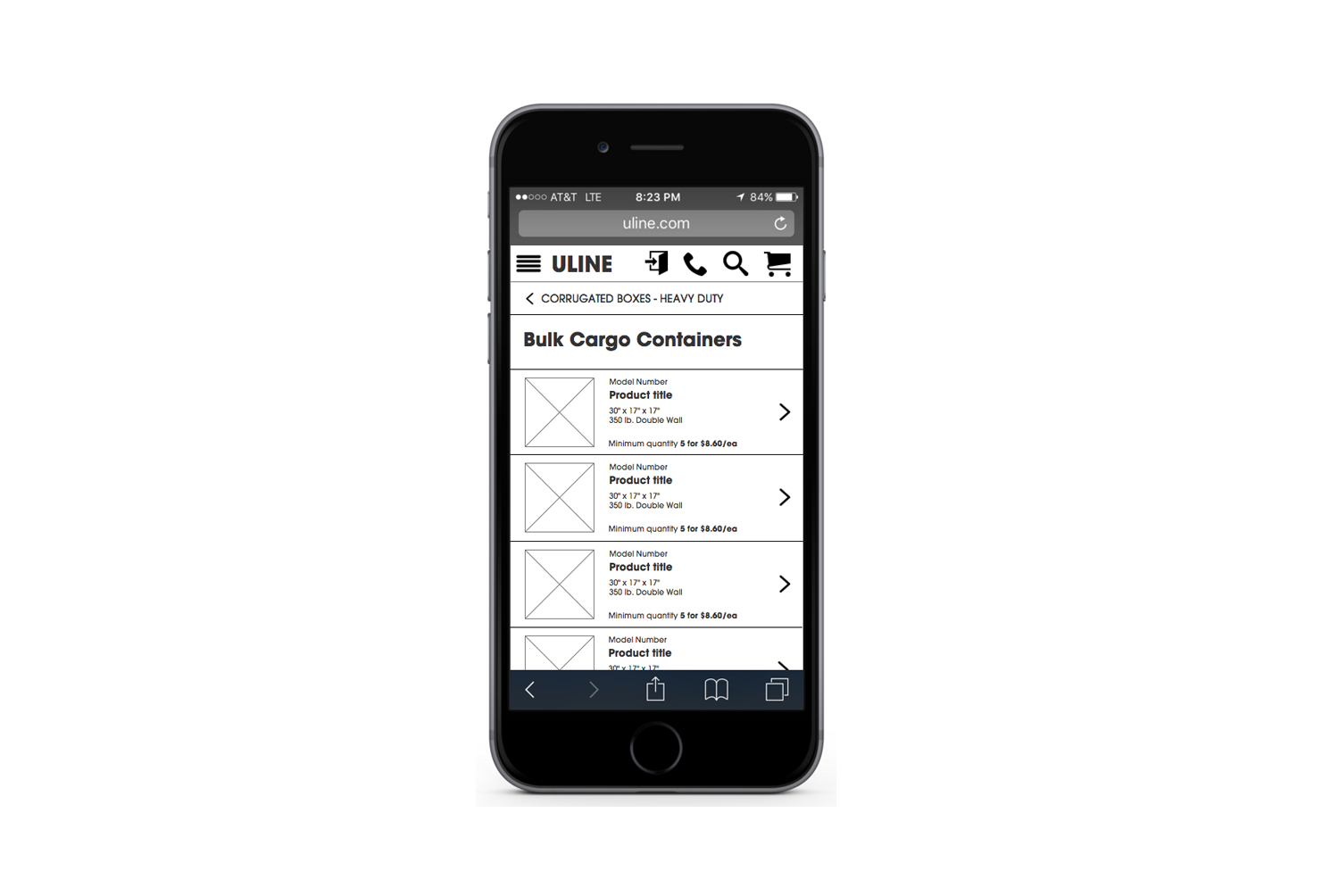
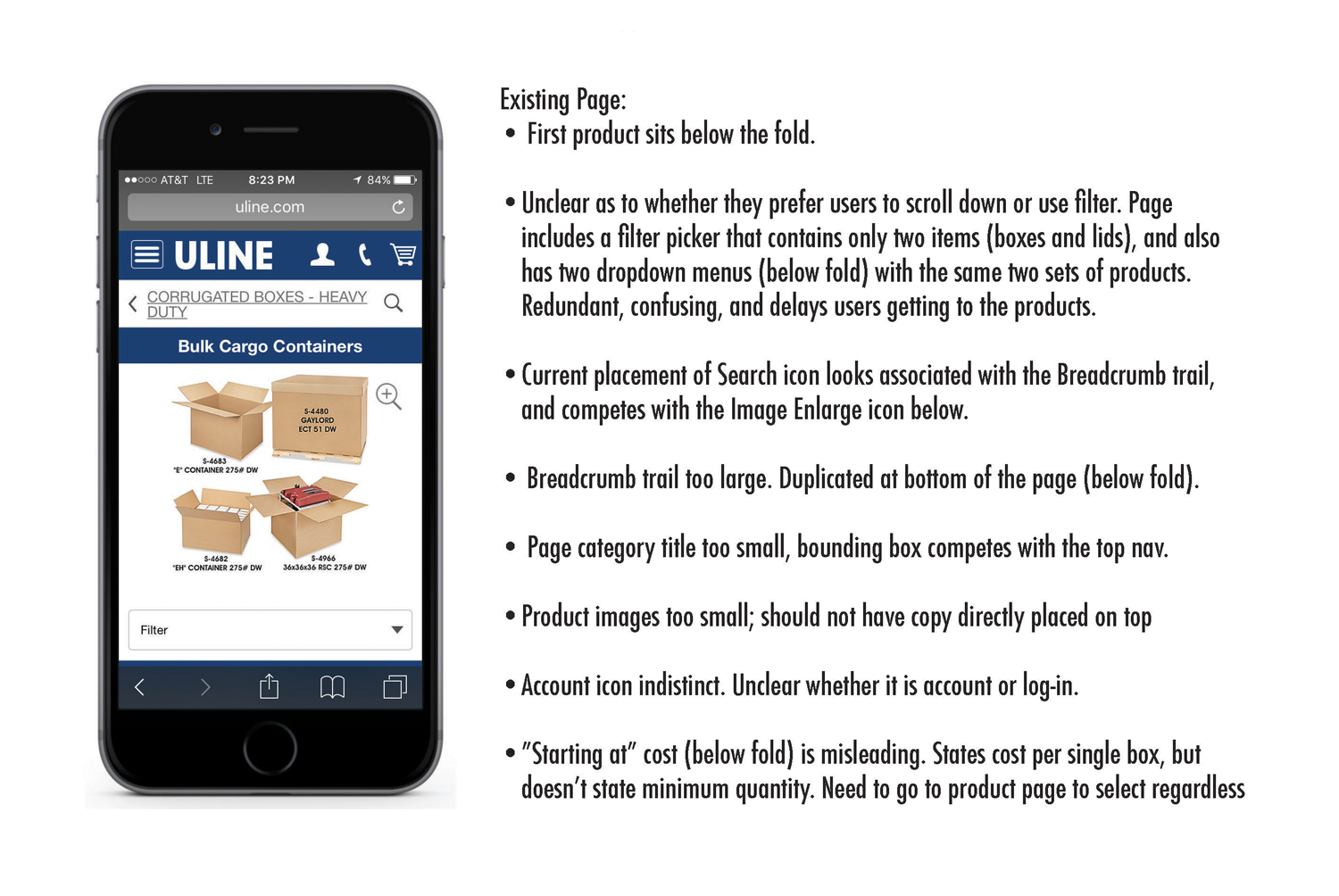
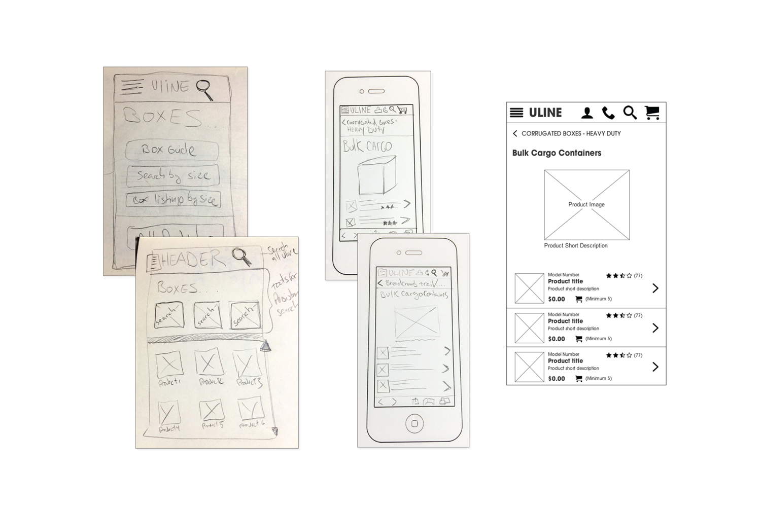
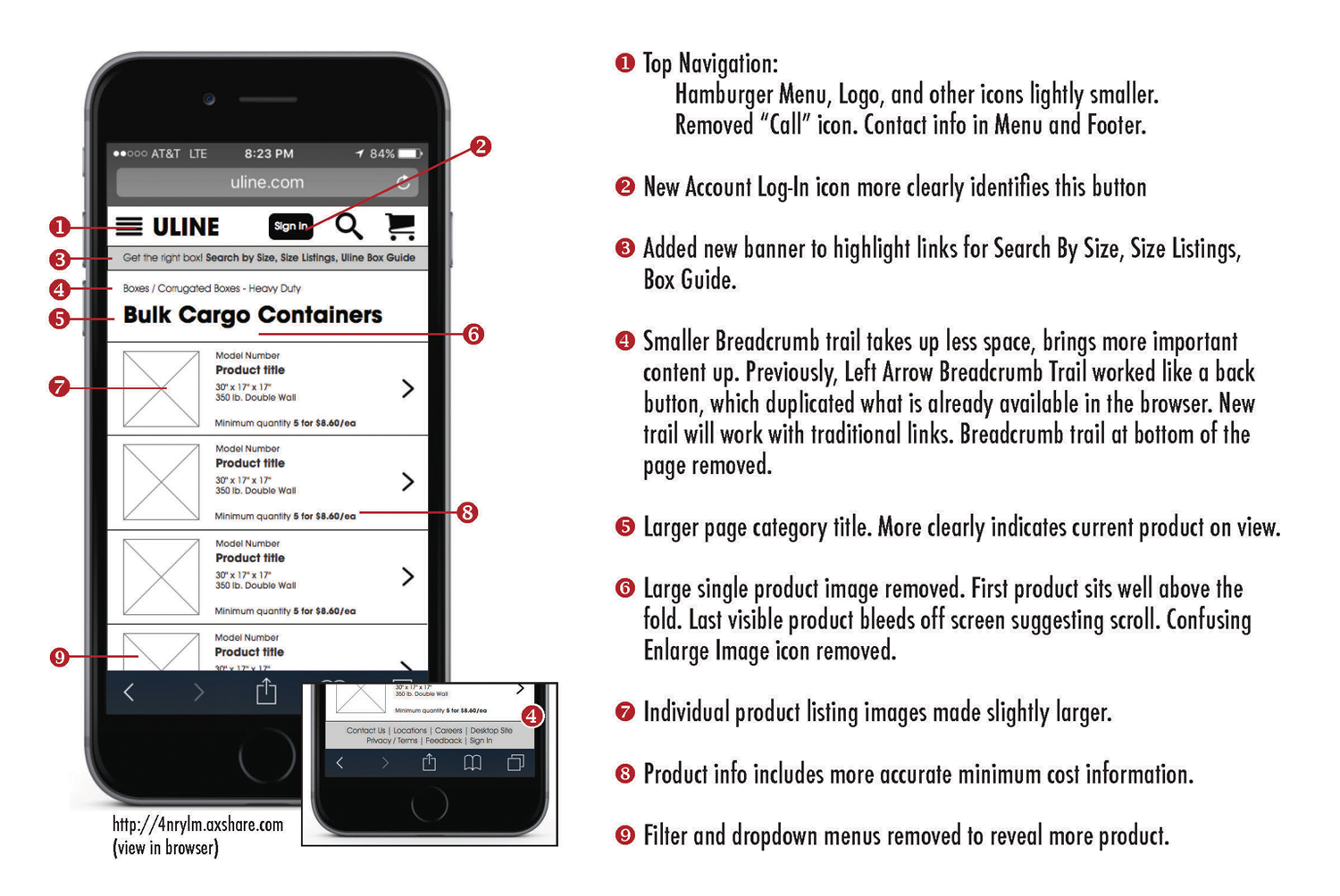
• Redesign options for a very atypical PLP layout. Specifically, the Uline PLP for their Bulk Cargo Containers. Design for mobile.
TOOLS/METHODS
• Analytics
• Interviews with stakeholders
• Sketching
• Site mapping
• Wireframing (Axure)
RESEARCH & ASSUMPTIONS
• Primary objective: to make a more-clear purchase path for existing users as well as for new mobile users.
• Based on the multiple points of entry for box products throughout the site, (i.e., five links on homepage including footer) boxes are very important to Uline. Maintaining this traffic is critical to their business, which includes growing Mobile traffic and purchases.
• The majority of users connect with the site from work. Offerings are more B2B leaning.
• Less than 20% of traffic comes from Search.
• Most users are generally familiar with box products (office managers, industrial sector, factories, small business owners), and know what they want before they get to the site. Price is less a consideration than the correct box.
• On the interior box product pages, users do not get the specific box search tools found only on the top level box product page. This suggests that currently, users are not using product specific search within the category. They are possibly relying on bookmarks, account history, and working directly with CSRs.
• But, for inbound traffic that goes to interior pages from search, some product specific search tools are needed because the current design doesn’t give any direction or indication that these tools exist. There are no direct links on the Bulk Cargo page to get to the Search By Size, Size Listing, or Box Guide creating friction for new users, and potentially hurting overall growth of the Uline mobile product.
https://popapp.in/w/projects/54cfac91c91630202dd46fa9/preview
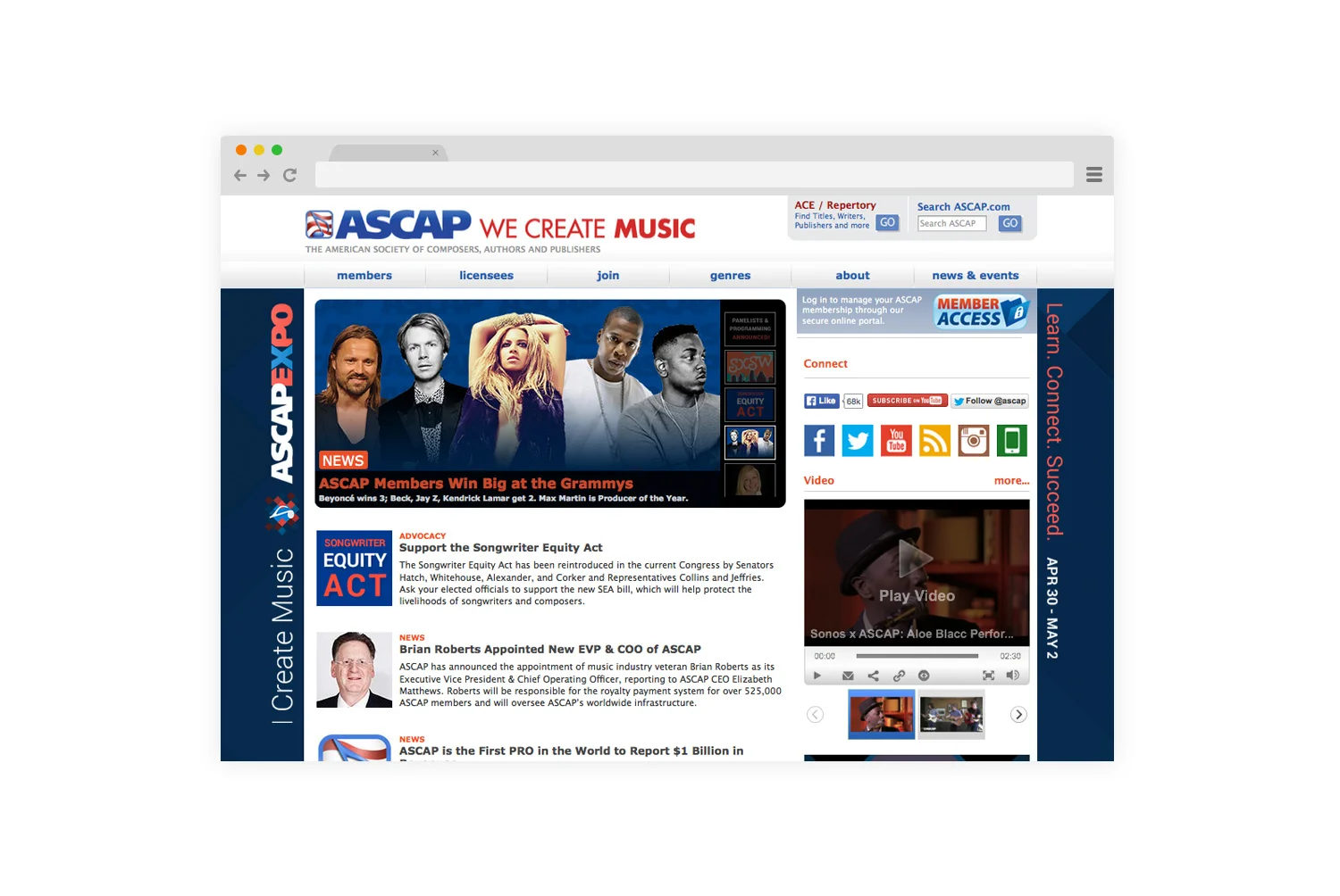
ASCAP (American Society of Composers, Authors and Publishers) is a membership association of more than 525,000 US composers, songwriters, lyricists and music publishers of every kind of music.
GOALS
• Develop a more contemporary look and feel for the site that keeps pace with the company's evolving brand, messaging, and diverse membership.
• Create a more clear and simplified site navigation and architecture to better organize content and make that content easier for our users to find.
• Based on user research, make the most-used features of the site more prominent: ACE title search, new member sign up, services and resources for licensees, existing member services.
• Provide more social media engagement.
TOOLS/METHODS
• Member survey data
• Interviews with members, licensees, and internal users
• Card sorting
• Sketching
• Site mapping
• Wireframing (Balsamiq)
• Prototyping (Paper, Photoshop)
• User testing
• Ongoing updates after launch
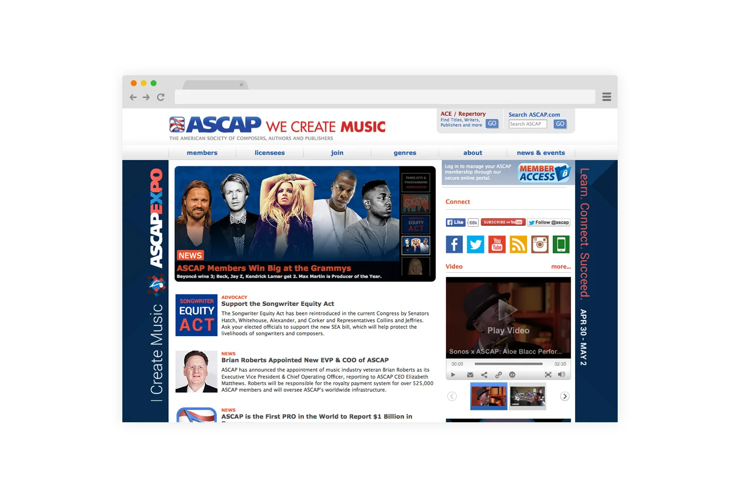
Features include prominent placements for ACE Title Search, New Member Sign-up, resources for Licensees, and Member Access (member tools and resources).
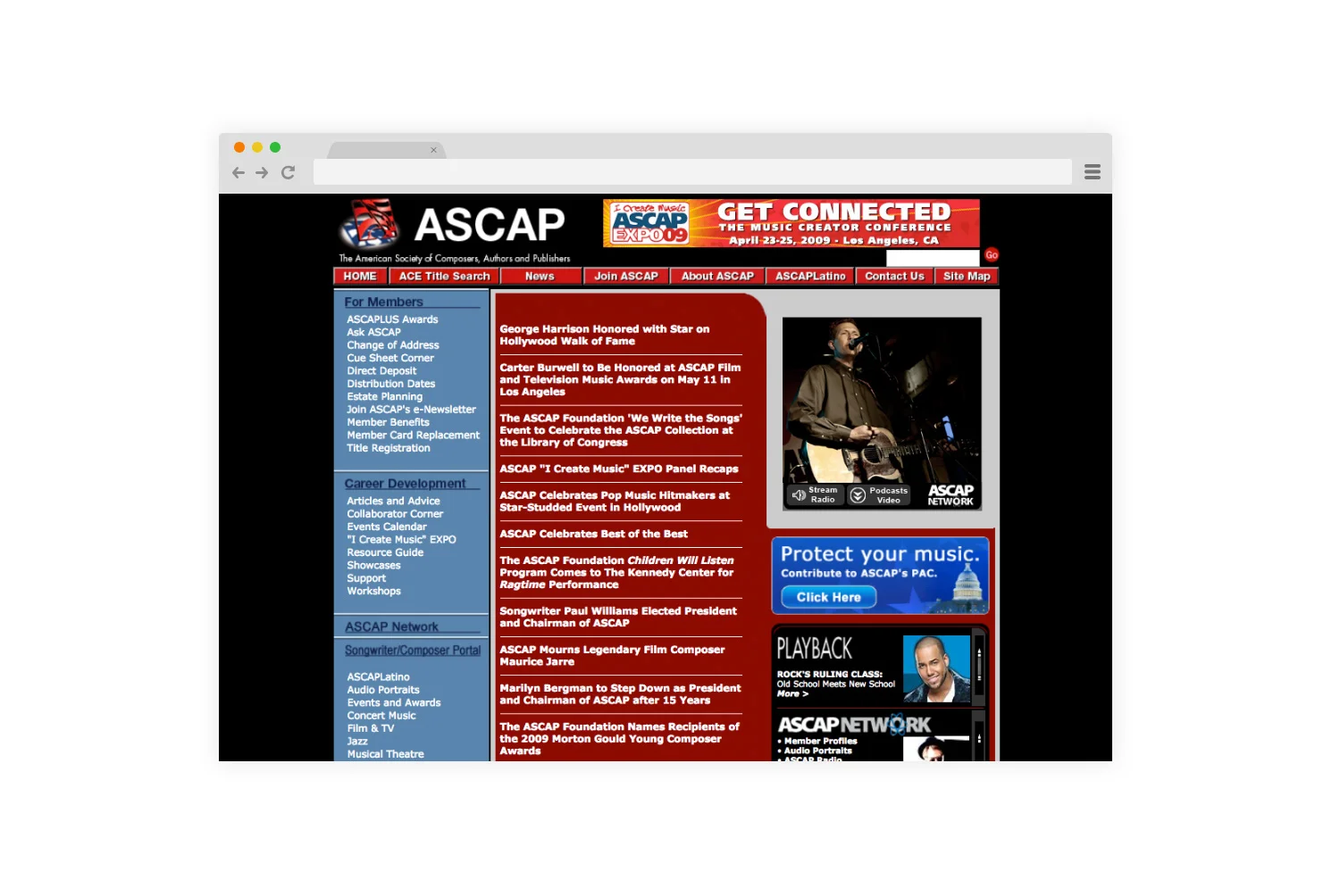
Challenges with the previous site included extremely dense level of content and clutter across the site, lack of clear architecture, no social engagement, little in the way of direction/way-finding for our user's most important tasks.
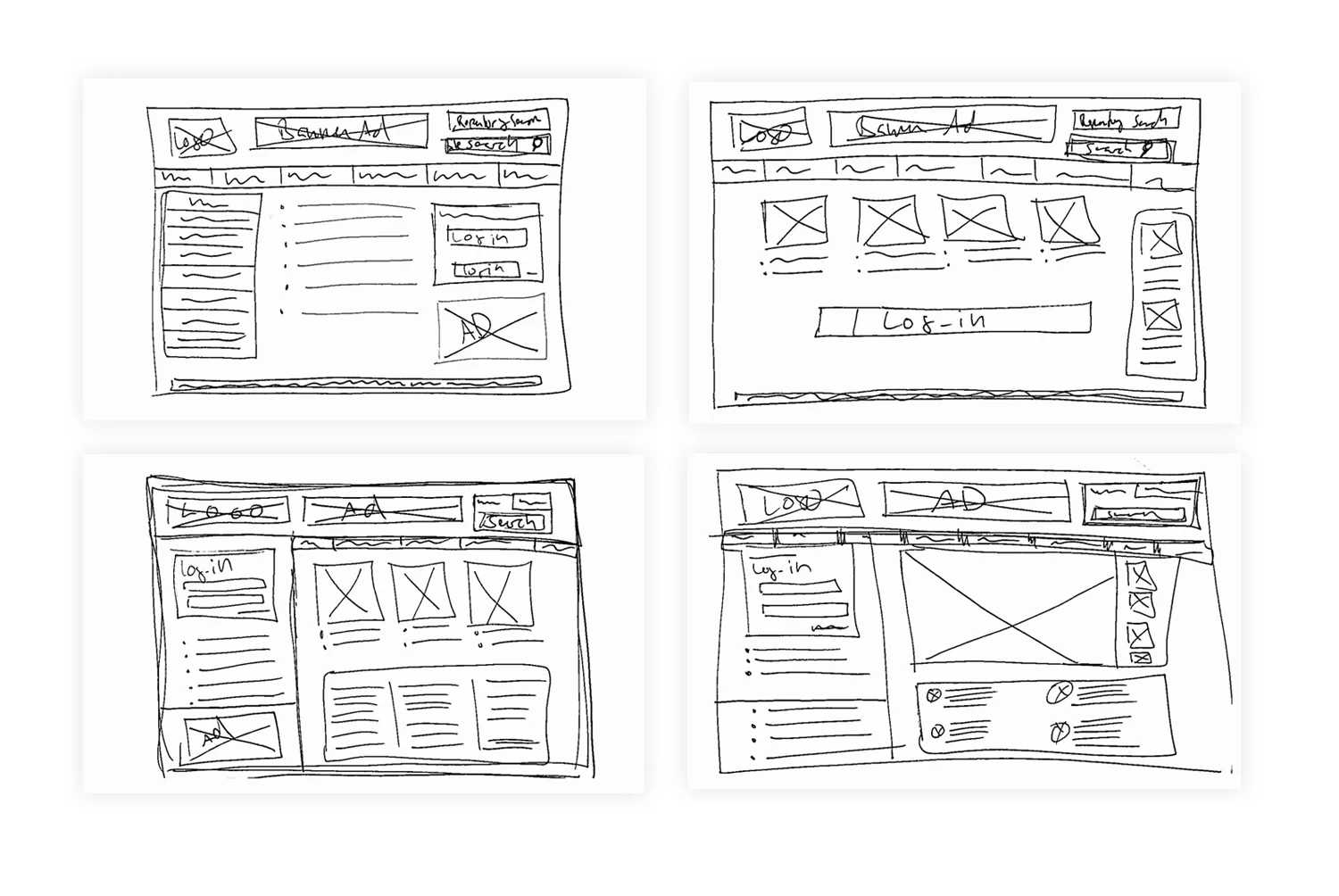
Several early sketches working on various homepage layouts.
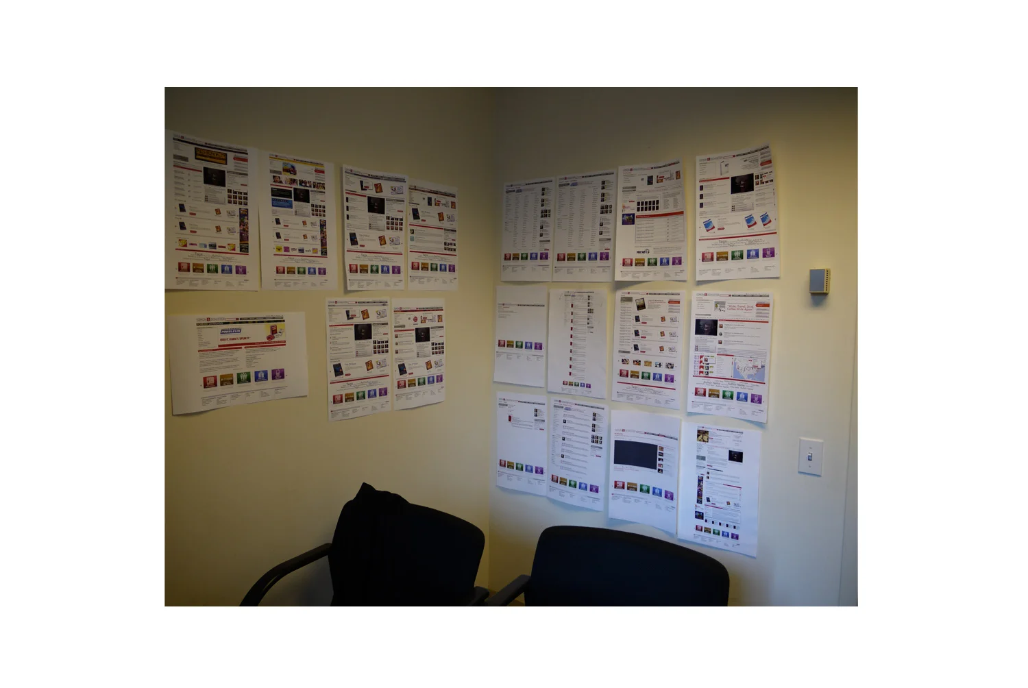
Moderate fidelity wireframes of several different pages across the site.
Mentor Series is an instructive program for travel and photography enthusiasts produced by Popular Photography magazine and sponsored by Nikon. For over 15 years, Mentor Series has traveled the globe, educating their "trekkers" on a broad range of photography and video techniques, with hands-on instruction by world-class professional photographers.
ASSIGNMENT/CHALLENGE
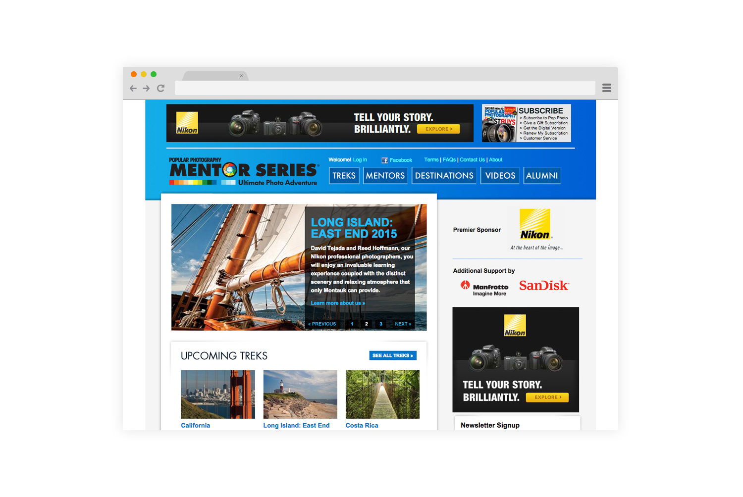
• To better communicate the strong visual aspect of the Mentor Series program, we needed to update the site from previous versions that were too text heavy and visually congested, to a site that featured more images, less copy, and had a simplified navigation. More space was allotted to larger and high-quality trek images.
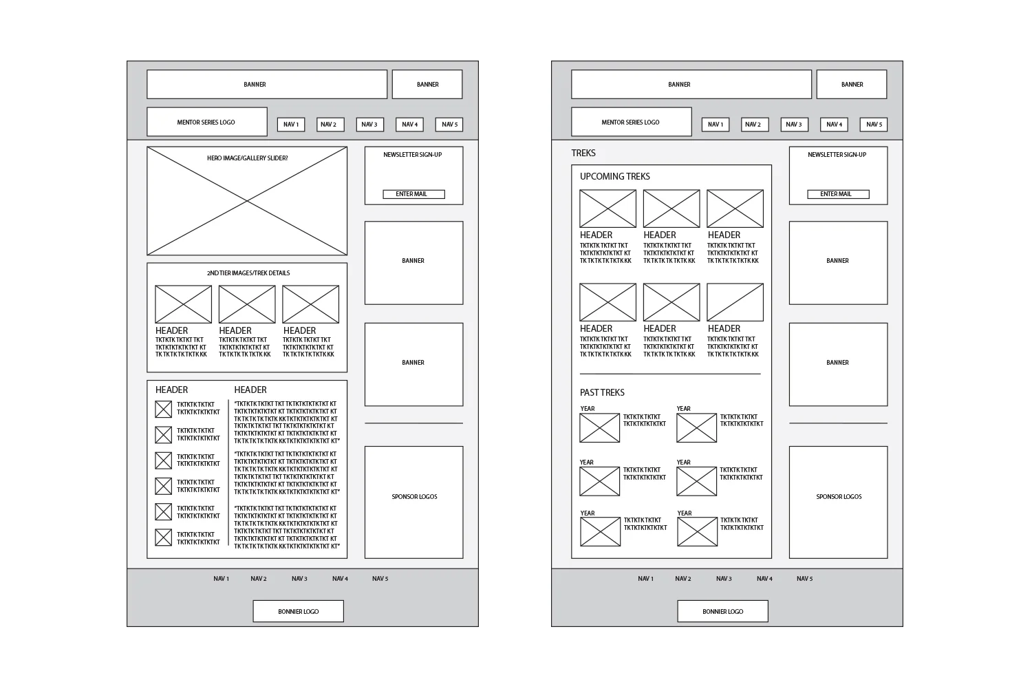
• In addition to updating the presentation of images on the site, our users also needed more information about our upcoming treks, not only in terms of where, but which treks were coming up next. The homepage now features two different sets of information for upcoming trips. A large carousel for the three immediate treks, and smaller snapshots for the following three programs.
• User feedback indicated that our users were extremely proactive and dedicated to learning about their craft, so the site needed to incorporate additional opportunities for interaction and community building. We developed areas of the site for our trekkers to tell their stories, post their images, connect with each other and our mentors.
TOOLS/METHODS
• Trekker/User surveys, interviews
• Persona and user-story development
• Card sorting
• Wireframing and prototyping (Illustrator, Photoshop)
• Ongoing updates and refinement since launch
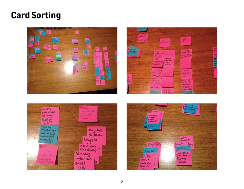
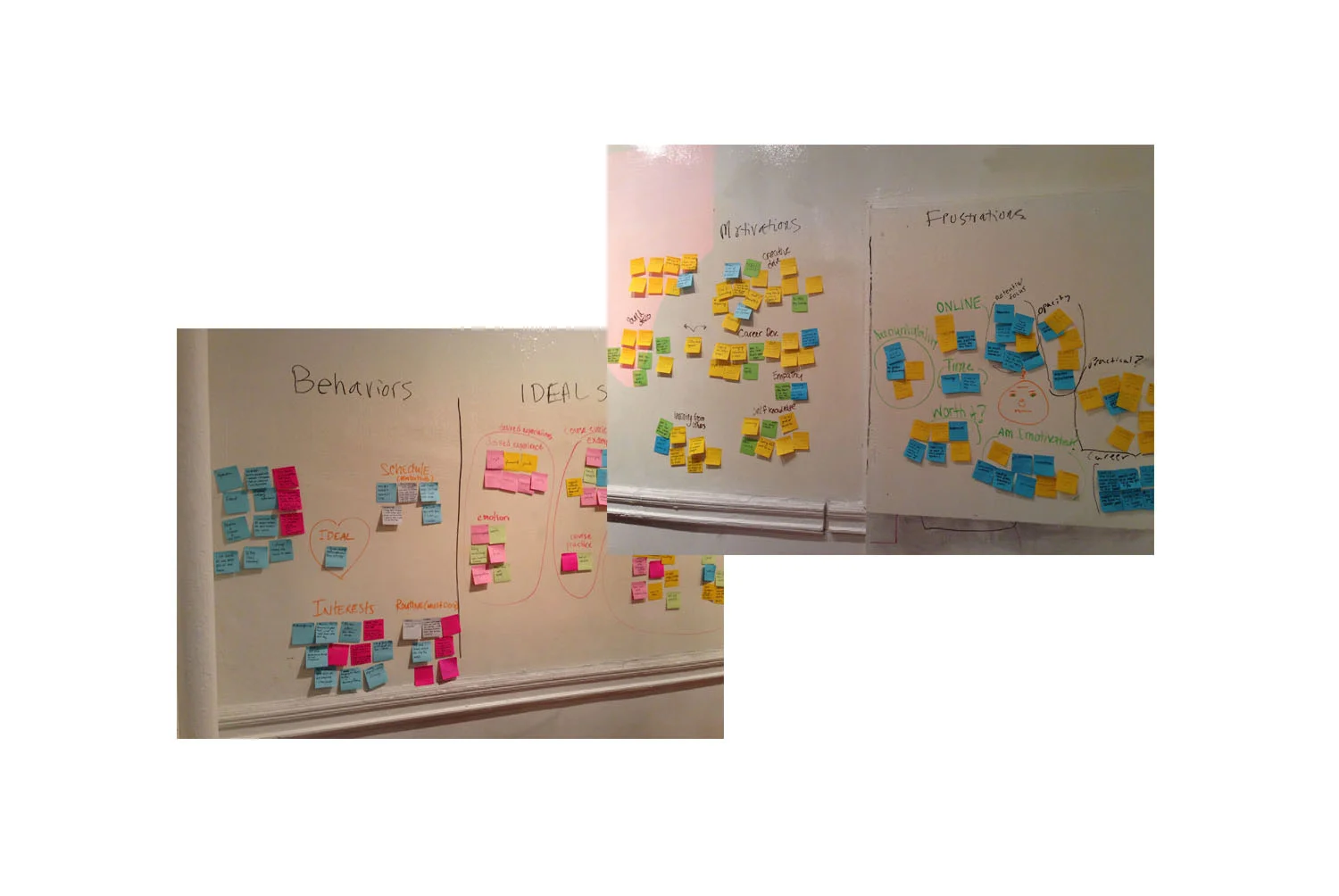
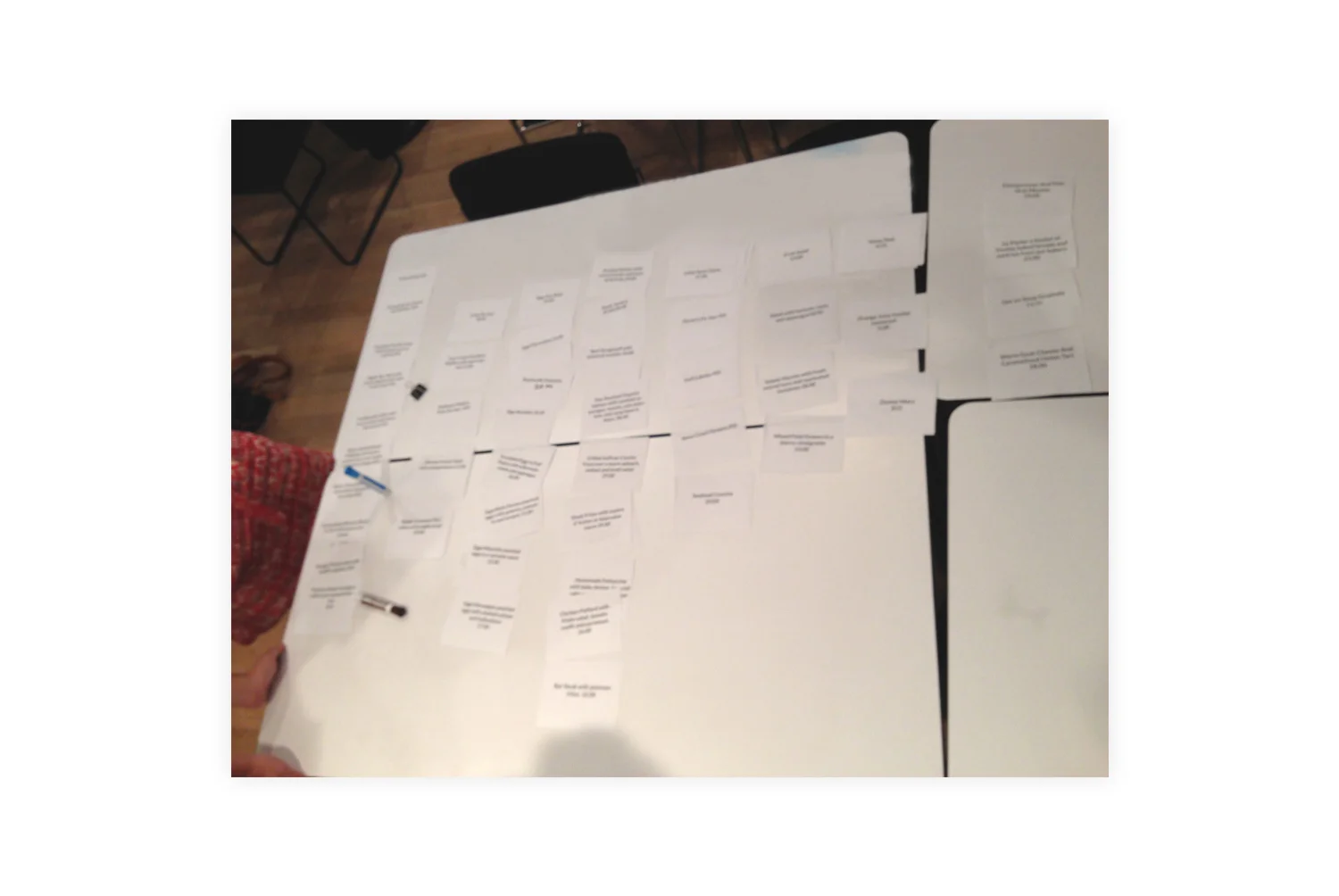
Multiple card sort results from user survey information and interview data.
Card sorting exercise working with navigational elements.
Early wireframes for Home and Treks pages.
Logo design for Popular Science's program of touring "info sessions" that bring cutting edge products and concepts to targeted clients and agencies around the country.
Logo for fund raising event which features original art inspired by poems of student athletes.
A national nonprofit, America SCORES serves 8,000 students at more than 150 public and charter schools in 14 major cities to inspire urban youth to lead healthy lives, be engaged students, and have the confidence and character to make a difference in the world.
Nonprofit support organization for musicians in need of financial assistance.
Logo for the ASCAP Green Room, a section of ASCAP’s Playback Magazine, and ASCAP.com, that spotlights songwriters and organizations that are leading the way on sustainable music business practices, greening tours, and educating fans about being a part of the solution to Global Warming.
Slagle Development is a California-based consultancy that manages the development of real estate that employees modern technology, materials, and assemblies to build beautiful, sophisticated, and landmark real estate.
The USA Memory Championship is an Olympiad for ‘thinking’ games. Set up as a sporting event for Mental Athletes, the tournament consists of memory challenging tournament-style competitive events.
Identity for Chicago-area accessories, handbags, and clothing retailer.
Jazz record label and musical events promotion company.
Logo for New York City's premier sea-chanty, blue-grass and folk music group.
Logo/Identity design for New York City-based leadership training offering executive coaching, workshops, and seminars.